Hey, are you a self-taught UI/UX designer? If yes, then this blog is going to be a gold mine for you. If not, then this will add to your knowledge about UI/UX designs. That’s a win situation too, right? So, hop on! Let’s talk about the UI/UX design trends that will dominate 2021, shall we?
The thing is, there’s always something new when it comes to designs. You may be wondering why! Well, whenever some format of design is trending, it rapidly saturates the market, right? Then the clients will start demanding “fresh” designs from you. How will you possibly produce it if you do not keep refilling your design ideas?
Trust me, I have faced the same issues as a designer myself. And if you are not here for the clients but for your brand, then that works out well too! So allow me to walk you through the research that I have done on the UI/UX design trends 2021.
The fundamentals of UI/UX design
So before we move on to the list of UI/UX design trends, let’s check if we are on the same page. To do that, let’s have a quick recapitulation of the fundamentals of UI/UX designs. This is really crucial.
“UX is the toolkit of the future. It’s more than a field — it’s a critical skill set everyone should have access to. Successful designers are able to extend their learnings to others while keeping users front and center.”
– Katharine Hargreaves (User Experience Design Immersive Instructor, GA Los Angeles)

Now tell me, what are the fundamentals of UI/UX design? Let me begin, drop in your comments if you disagree with any of these or want to add any points to the list.
- User Psychology – Having a basic understanding of what users want is what this is about. What attracts them and what drives them away, is the most vital thing to know about, before getting into any of the UI/UX design trends.
- Design strategy – UX design is about turning the user’s needs into action. Your basic UI/UX strategy should focus on the user base and not the business goals.
- Usability – Making a visually attractive digital product isn’t all. It has to help the users solve their problems and easily navigate through the app or website. If you can’t design a digital product with good usability, then the UI/UX design isn’t good enough.
- Validation – UX designs are iterative cycles of critical thinking and creativity. A proper feedback from the user base could help a lot in this procedure. This also a window where the lean product development process or the Minimum Viable Product approach comes in. To know more about it, read our blog on MVP. And in case you need to build a MVP product for your brand, feel free to reach out to us at TheCodeWork.
Now that we are done with the fundamentals of UI/UX design, let’s get to the core of this blog. Stay with me, the best part is here!
UI/UX design trends 2021
At TheCodeWork, we have had some decent experience in the field of UI/UX design. You can check it out at our portfolio. So yes, we know how to produce visually pleasing UI/UX designs to suit the industry level, using the UI/UX trends from time to time.
Also, before we proceed, I have to share this. My friend recently shared this great source for learning more about the basics of UI designs. You can have a look if you want – https://refactoringui.com/. I loved this one and moved on to the book as well. It’s worth the effort!
1. Typography
Typography is one of the most important design tools that exist. The fonts that you use reflect your taste as a brand and are also a major tool for attracting customers. What I mean is, typography reflects your design aesthetics. Your ability to select the right kind of fonts as per the personality of the brand, speaks a lot about your design sense. So we can’t compromise on that part at all. Are you getting my point?
For this reason, bold typography has shown great results in performing the stated functions. It has a great potential towards attracting customers, if used correctly with the proper edits.
Also, 2021 expects the return of serif typefaces. Serif fonts look amazing in print mode but due to the lack of good resolution in older phones, it was difficult to read and had gone out of trend. Have a look at the types of serif fonts. Lovely, aren’t they?
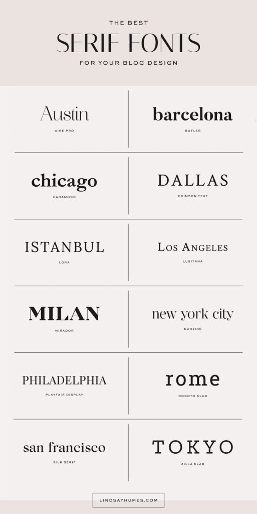
However, thanks to the evolution of technology, resolution is better now and serif typefaces are resurfacing. What a relief!
Typography helps to outline and highlight the designs. It works best with minimalistic projects highlighting the structure and design. It also influences their decisions in most cases. See the importance of typography yet?
2. 3D illustrations (Yes, it’s still here)
3D designs and typography have been the essence of the design market for a long time now. With interactive illustrations to bold typography and data, monitoring outlays, 3D is a vital UI/UX design trend. Don’t you agree?
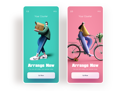
Interactive designs are adding to the user experience. 3D illustrations add to this vibrant experience and make the product look appealing as well. Also, with virtual reality gripping the market, 3D has become a part of the game. Sounds and looks amazing, I say. Personally, I hope this trend never fades.
The latest UI/UX design trend includes creative 3D art and illustrations with the intelligent use of white space.
3. Virtual reality
So what is Virtual reality? Well, it is a collection of computer-generated statistics and data which makes it possible to experience things in a live mode. It has become successful in blurring the line that separates the virtual from the real world.
Guess what? Studies on UX/UI designs predict that with the evolution of technology, the screen interface may soon become out-dated. Augmented reality/virtual reality may soon replace the layout of screens, for a better user experience.
Wait, have you checked out the video ad for Microsoft Mesh? This is exactly what I am talking about. Have a look! (Link)
This will allow user experience flow in absence of physical tools and devices. How cool is that? With rapid advancements in technology, users are no more satisfied with seeing things, they want to live them. This is how virtual reality is gaining its ground.
4. Light Gradients
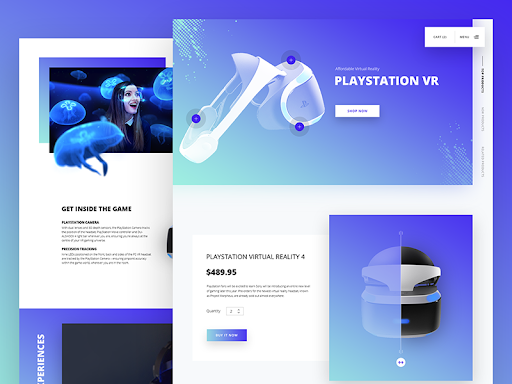
Minimalism is love these days! Everyone wants simple, classy, and subtle designs now. As they say, “less is more”. Consequently, the bright and gaudy designs do not work anymore.
Maximum designers have turned to warm and subtle gradients in their work. It’s all about maintaining simplicity yet not going too dry. Are you getting my point?
The basic purpose of using gradients in UI/UX design is to highlight the important areas. So, a little bit of flamboyance is needed but then again, never too much of it.
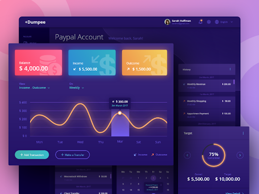
Now the usage of this flamboyance depends on the taste of the designer. It shouldn’t start leaking all over the page. Remember, minimalism is the need of the hour! Nothing is better than a readable UI that is aesthetically pleasing yet minimal.
Sounds serene, right? Looks and feels the same as well. Try and tell!
5. Cross-platform designs
If you are to design a digital product that is to launch as a mobile app as well as a website, then the cross-platform design is the best choice. Don’t you think? It uses advanced frameworks in addition to libraries like React Native to build products with expressive user interfaces from a single code base.
And you know what? By reusing this code, the cross-platform development approach reduces the investment and time that you need for a web app design. Isn’t that cool?
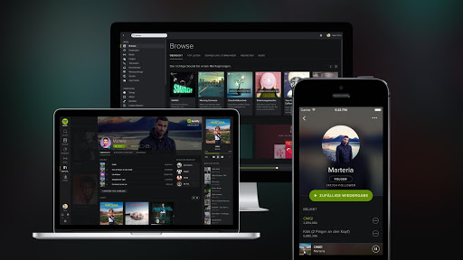
And the most interesting fact is that it also guarantees design consistency. Imagine! Maintaining the inherent look & feel that identifies with the brand is so important and cross-platform designs help you with that.
With this cross-platform design approach, the UX and UI designers function with multi-device support from the very beginning. Once set in, they smoothly adapt the designs for various individual platforms.
There, that’s how it works and also why it’s trending. Try and tell!
6. Crisp and quirky layout
Billions of people visit numerous websites and web pages each day. So, to stand out from the crowd, various brands have started to change the normal disciplinary layouts of their designs. This has become successful in creating a trend across the UI/UX design interface. The basic thing is to quirk it out!
The quirky layout that I keep talking about, has geometric lines and shapes that contain the basic icons and tools in the right space. This makes the layout look clean and has a decent visual structure. Doesn’t it sound amazing?
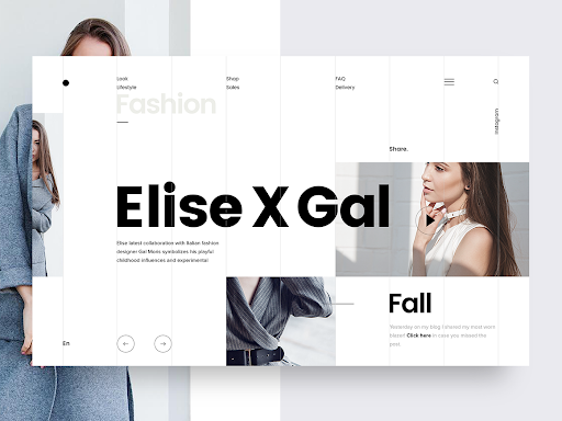
So, to break the monotony of symmetry, you can use this new trend of geometry. Add some broken grids and asymmetrical lines to get the attention of the users. Such layouts promptly grab the eyeballs and navigate them to the real content or highlight of the page. Now that is smooth!
This method gives a creative outlook to the sites and is already trending as a compulsive design feature. Try it out! What are you waiting for?
7. Micro-interactions
One of the most important aspects of UI/UX designs is to understand user psychology as I already said. Hence maintaining and fulfilling user expectations is a task and a micro-interaction segment is a tiny yet important part of this. Wait, I will explain a bit more.
Micro-interactions are basically an opportunity for the product and design to deliver an actual human-like experience. You can use any automotive tool, like a chat bot or an animated character, for this segment. It basically collects data, receives customer feedback, helps in navigation through the site, and additionally serves some amusement to the user.
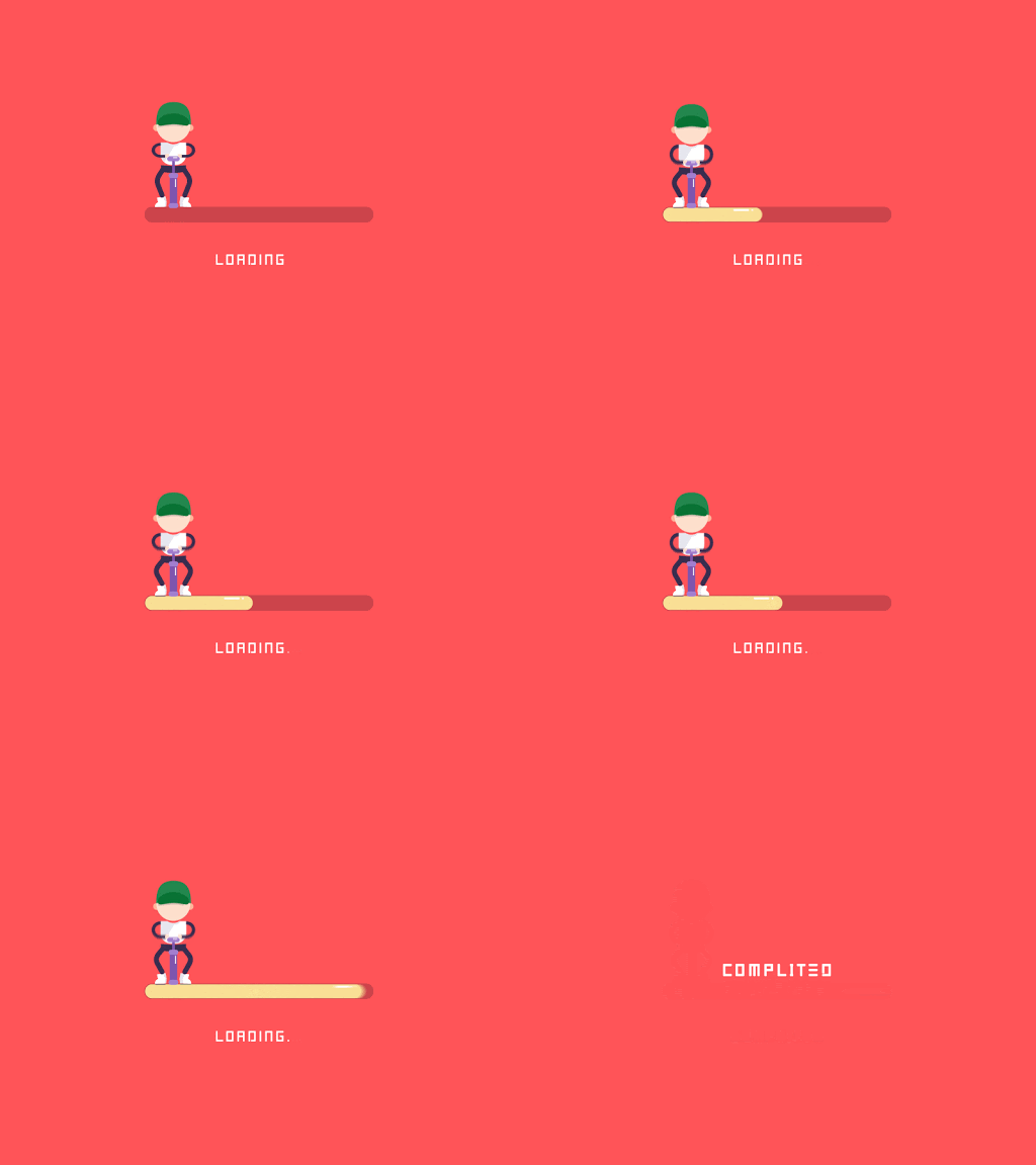
Micro-interactions are little amusements instilled in the design of a digital product. It just adds a fun segment to the user experience and user interface. And guess what? I know people who interact with their chatbots just for fun. This is new and cool. So don’t hold back on the implementation of it.
And here’s the best part – It also helps increase website retention, increases website traffic, and enhances customer satisfaction. Now isn’t that something you would want for your business?
8. Doodle/Illustrations
Perfection gets boring at times, don’t you think? This is exactly why doodles have become so popular these days. It’s fast, quirky, and vibrant. This almost describes the digital space that we are a part of.
The imperfections of handmade doodles and illustrations make it simple yet elegant to look at.
Do you know the best part? Doodles and illustrations add a personal touch to the whole product design, thus adding greatly to the user experience. How cool is that!
The users love the application of doodles in UI/UX development, so here we are! Serving the user psychology as much as we can. It does add a personal, human-centric, and natural feel to the brand identity of a business in the market. This had to be on the list and I am pretty sure, it’s a permanent one for now!
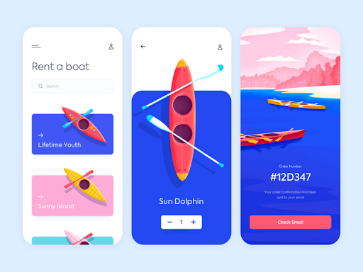
Since 2019 and the last year itself, studies and customer engagement has revealed that they prefer doodles and illustrations as a prime design feature for their brand/business. You can check out some sites for cool doodles and illustrations in our blog on design tools (refer to design blog) to use in your UI/UX projects. Hey, thank me later!
9. Touch less interactions
This one became popular since the pandemic came into action. With the social distancing norms, users and clients started asking for touch less interactions like air gesture control or even voice user interface (VUI). I mean, this had to be on the list right?
However, if we keep the pandemic aside for a while, the voice user interface was already popular. But now it is crucial because VUI can help you expand your reach as a company. See how luxury became a necessity? I know right! As per some UI/UX design experts, voice interaction will take over the design forum real soon. Wait and watch!
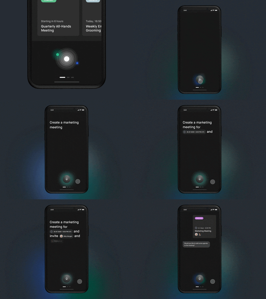
Coming to air gesture control, it is an advanced form of touch screen format. It is exactly what the name suggests – actions in the air control the operations. For example, a European luxury car brand by the name DS Automobiles recently showcased contactless controls via mid-air activities. Can you even imagine?
10. Hi-tech landing pages
This is one of those trends that never run out! Especially with the growing technology, it just gains more ground. I am talking about hi-tech landing pages here. An abstract demonstration of products and services is a great option for the tech- and production-oriented sites.
This hi-tech strategy includes complex renders, hyper-realistic complex animations, and 3D illustrations which successfully attract, captivate and amaze! That’s all we want, don’t we?
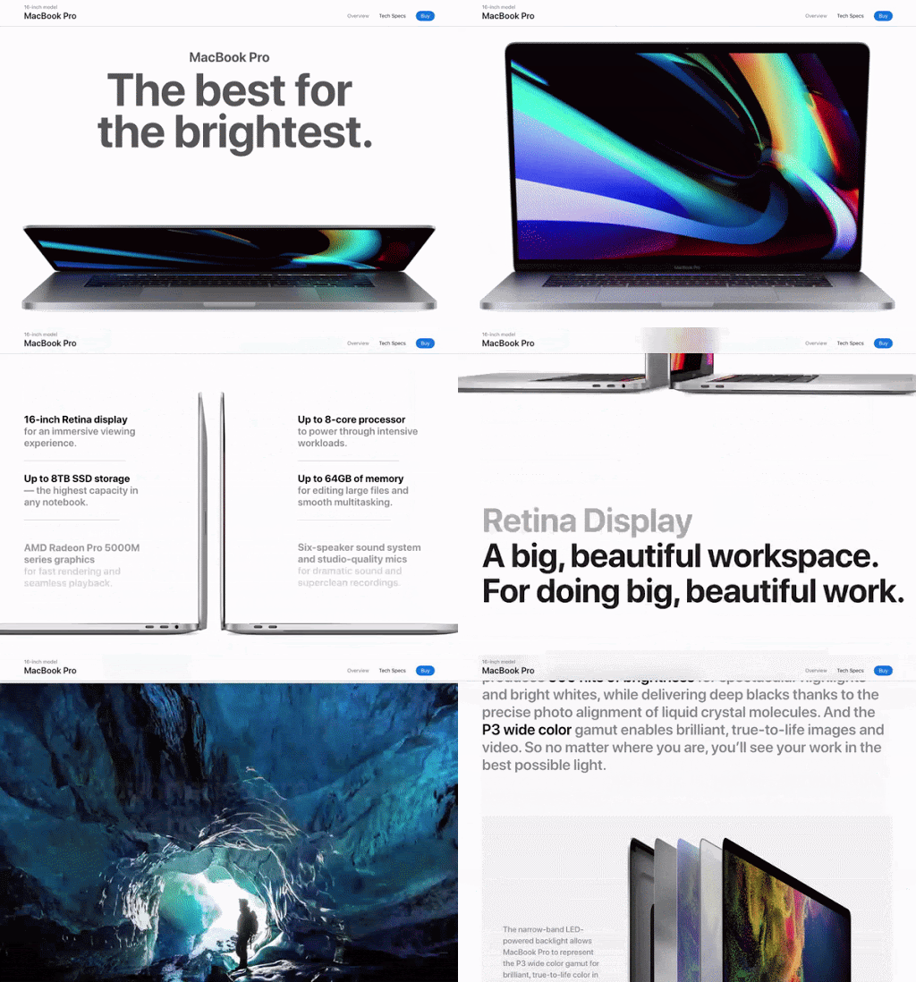
I must tell you, it’s like various shades of awesome. This approach actually holds on to the audience who are bored easily. There are all types of people right? And we have designs for all of them. No worries!
Overview
With the evolution of digital prominence, the influence of UI/UX Design has grown in significance. And that’s pretty obvious and evident. The UI/UX design trends that I stated above are not just for now. They will rule the market in the near future as well. Trust me on this.
The above stated UI/UX design trends feed the aesthetic sense of customers. They have proven to deliver a better user experience that is fun as well as serves the purpose. What else am I missing? A proper application of these UI/UX trends along with user feedback and validation will result in an enhanced user experience.
Remember, UI/UX design and UI/UX design trends is all about design relevance and critical thinking. So as long as you have that sense, you and your designs will never run out of style!
However, if you feel like you could use some help regarding UI/UX development or product development as a whole, then reach out to us, at TheCodeWork. We are here for you.
Happy designing!
